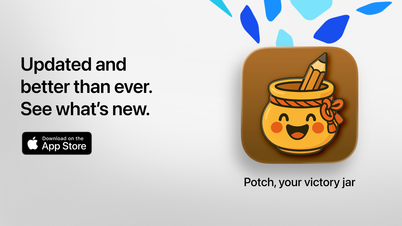
Potch 2.0: behind the scenes of a major update
A bit like a developer’s diary, I’m answering here the questions you might be asking, and some you didn’t think to ask.
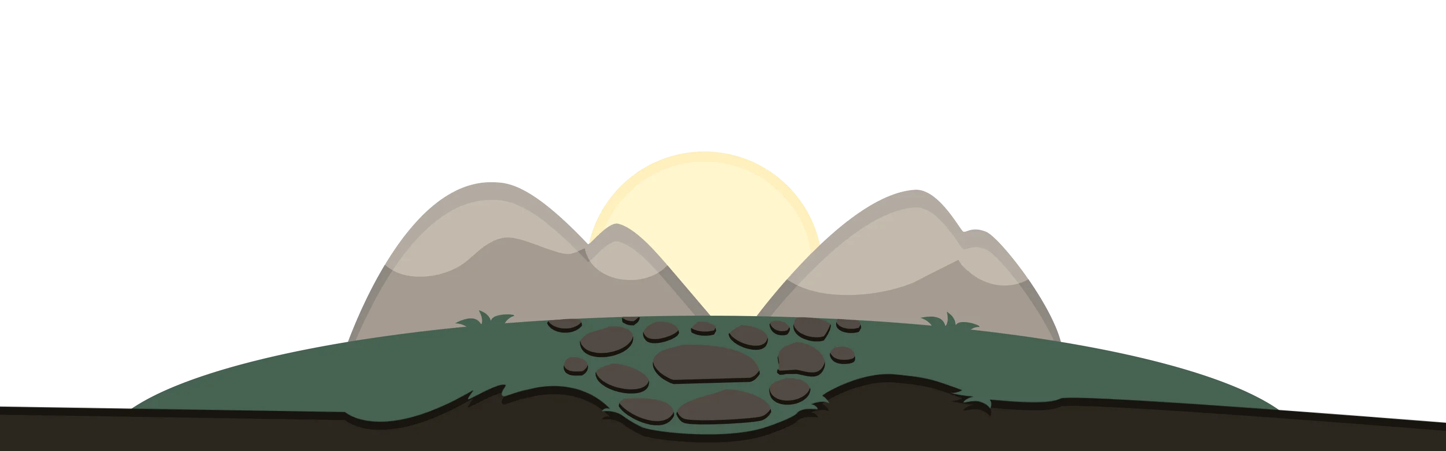
🎨 Environments
Where did the idea of hiring an artist for the environments come from?
Honestly, from frustration. The wallpapers in the first version of Potch didn’t satisfy me. They did the job, but they didn’t create the atmosphere I wanted. Potch is an app about small daily wins: it deserves a setting that inspires, not generic images.
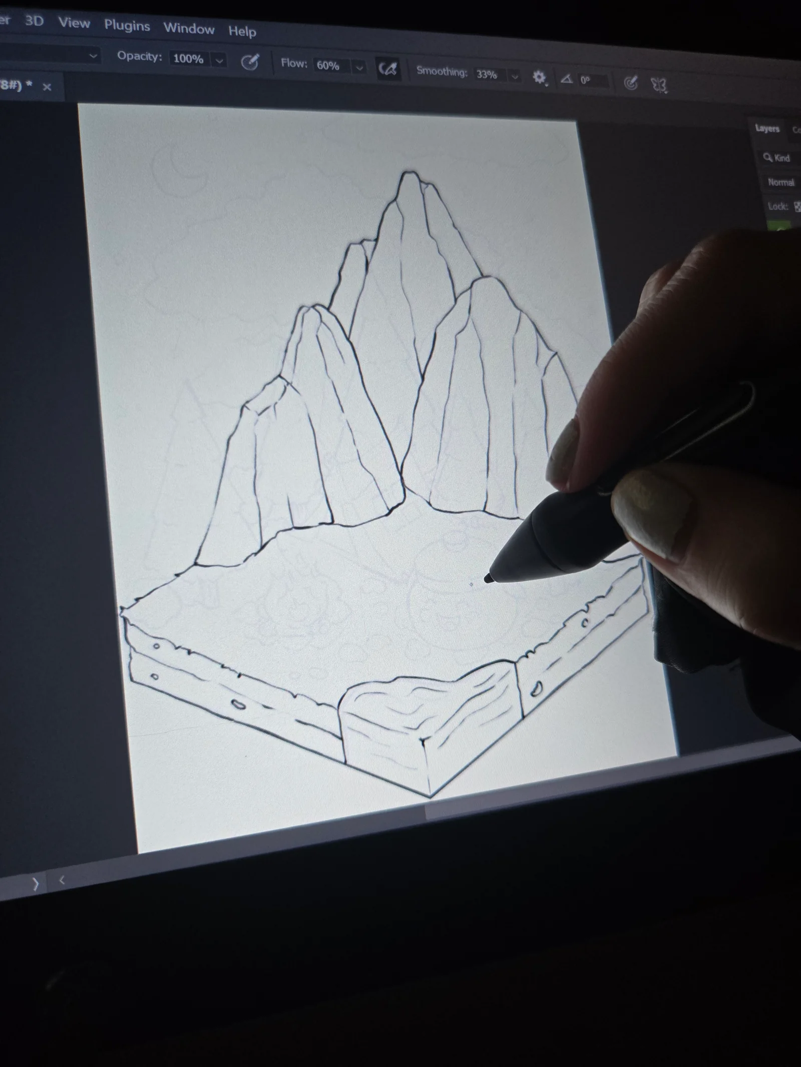
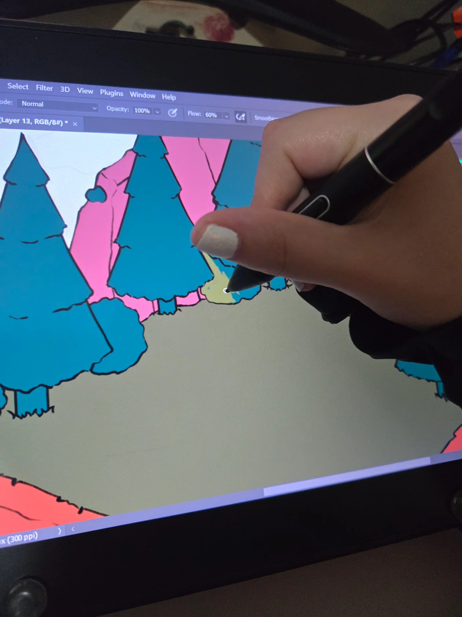
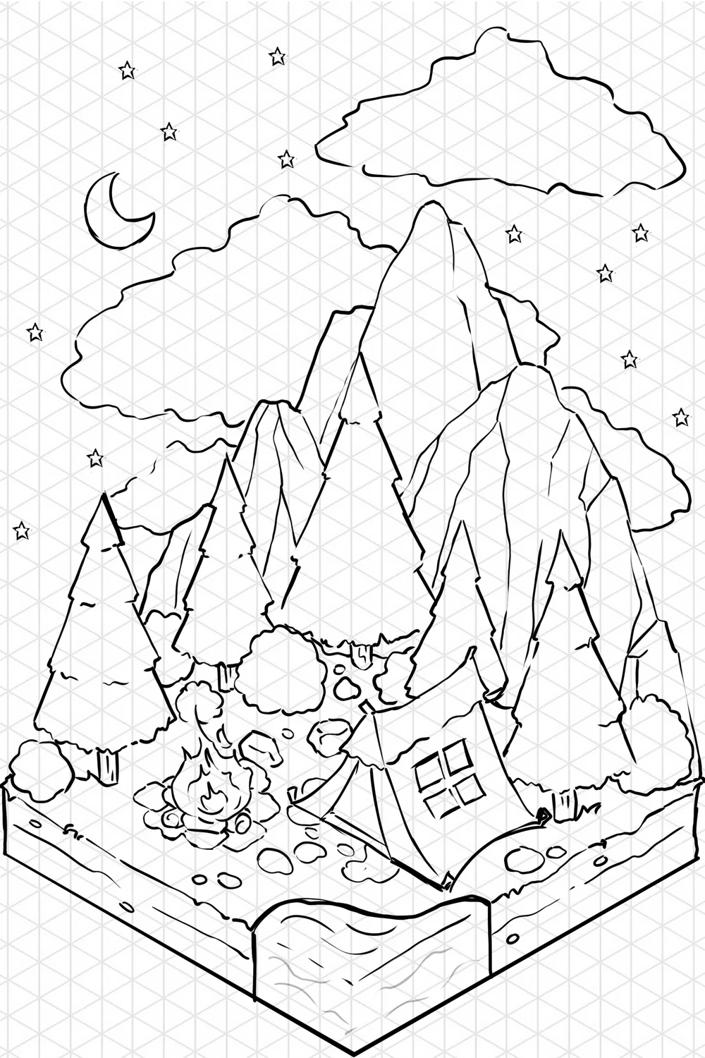
Except I didn’t know anyone in the illustration world. So I searched, contacted several artists, browsed portfolios… until I found several people whose style matched exactly what I had in mind: warm, cozy scenes with a distinctive touch.
And the “dynamic based on time of day” feature: was that planned from the start?
It came along the way. The mascot already spoke differently depending on the time of day, but the environments were always static, shown during daytime. Once the first environments were delivered, I thought: it would be a shame to keep them frozen. I really love apps and interfaces that subtly evolve throughout the day. It creates a kind of presence.
So now, some scenes change in the morning, evening, and at night. It’s a small touch, but I think it makes a real difference in how the app feels.
Are more environments coming?
Yes, and I have even more ideas. In the longer term, I’d love for some backgrounds to change with the seasons: a winter scene in January, cherry blossoms in spring… It’s in the backlog, not yet scheduled, but the desire is there.
🖼️ Illustrations: choosing the real deal
You replaced the illustrations from the previous version. Why?
Those older generated images were placeholders, rough drafts, waiting for something better. The “better” is here now in this version 2.0.
Beyond that, they weren’t up to the mark. The old visuals filled the space, but they had no soul. I didn’t like them, and I knew users would eventually stop liking them too.
On top of that, some of those old visuals had been AI-generated, and that didn’t align with what I wanted for Potch.
Why not keep using AI?
Because Potch is about authenticity. The app is here for people to take the time to acknowledge what they accomplish, to be real with themselves. Illustrating that with images generated without a human touch… that’s contradictory.
And then there’s a practical aspect: style. When you work with an artist, you build a coherent visual identity. Every environment has the same touch, the same texture, the same warmth. That’s something AI can’t consistently deliver.
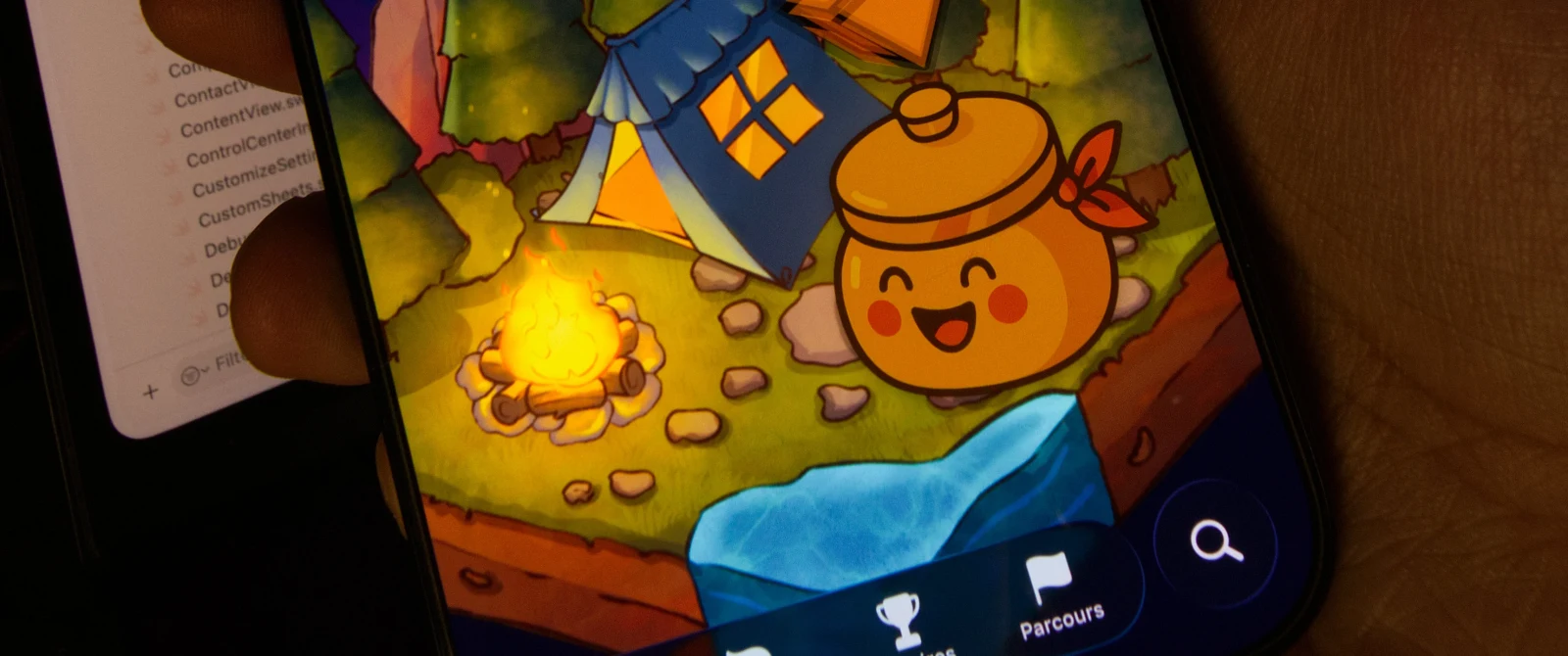
I hired several freelance illustrators for different assets: the home screen environments, some section illustrations, the buildings and elements in the garden. These are real people, paid for their work. It’s a real cost, and it’s actually one of the reasons some content has moved behind the Potch+ subscription.
🌱 The Garden
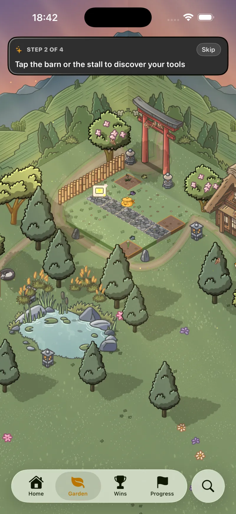
Where did the idea for the garden come from?
From a simple observation: writing down a win is great. But if nothing happens after, you eventually stop doing it. I’m one of those people whose brain needs something concrete, something tangible to stay motivated. A counter going up isn’t enough. I need visual feedback, something that moves, that evolves, that rewards the effort.
I’ve always loved games with a progression element: planting, building, watching a little world evolve. And I thought: why couldn’t Potch do that? Not become a game, but integrate this gentle progression mechanic that makes you want to come back.
The garden is that. It’s not a race, it’s not a leaderboard, it’s a reflection of your journey. Every win brings it a little more to life.
How does it actually work?
When you log a win, you earn XP. The longer your text, the more photos you add, the more you enable GPS location, the more XP you earn. By accumulating XP, you level up. And every day, you can get a raffle ticket (two if you’re a Potch+ subscriber).
You exchange your ticket in the garden to get a random seed. There are rarities: common, uncommon, rare, epic. There are starter packs and seasonal event packs. You plant your seed in a plot, and it grows over time. Concretely, it’s by adding a win each day that the plant advances in its growth. Some take 5 days, others 14. And if it rains or there’s a storm in the garden, growth gets a small boost.
It’s intentionally slow. Potch isn’t designed to be a game where you rush to go as fast as possible, but a space where you take your time. The garden evolves with you, not against you.
Why an isometric view?
Because I love it, plain and simple. I grew up with isometric games and I find it gives a depth and charm that flat 2D doesn’t have. Technically, it’s built with SpriteKit and Swift, assembling tiles and 2D assets drawn by an illustrator. This gives a warm, handcrafted feel.
The garden has plots for planting, buildings like a barn (which opens your seed inventory), and a space that expands as you progress. The idea is that your little patch of land becomes richer and richer as you use the app.
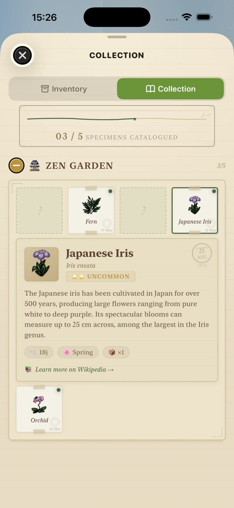
And the herbarium, what’s that?
It’s a catalog of all the plants you’ve discovered. Each species has a card with real botanical information sourced from Wikipedia, with a link to the full article. I liked the idea that by using Potch, you’d learn something along the way. It’s a small detail, but it’s part of the app’s identity: we don’t pretend — the plants are real.
There are also themed collections in the herbarium (Zen Garden, Sakura Dreams…). It’s a collecting aspect I want to develop further in future versions.
And the Gardener’s Gazette?
It’s a small journal, a newsletter right inside the app, accessible from the garden. The idea is to have a space where users can stay informed about ongoing events, without going through a notification or an email. Announcing something new, sharing a tip, dropping a word. It’s a gentle, non-intrusive channel that reinforces the “little living world” feel of the garden.
🌦️ The weather system
The garden even has weather and seasons?
Yes! The garden without weather would be a static backdrop. And a static backdrop eventually becomes invisible or feels like it never changes. I wanted the garden to feel alive, to make you want to look at it, to see what’s changed.
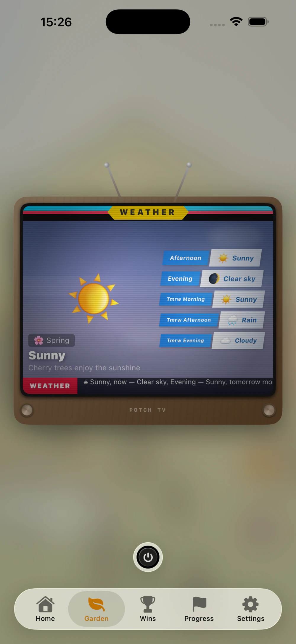
The garden’s weather system works offline. It doesn’t depend on the user’s location or an external API. It’s an internal engine that generates a believable weather cycle based on real data from Kyoto, Japan. (Unlike adding a win, where the user can add their real location, and actual real-world weather is pulled from it.)
Why Kyoto?
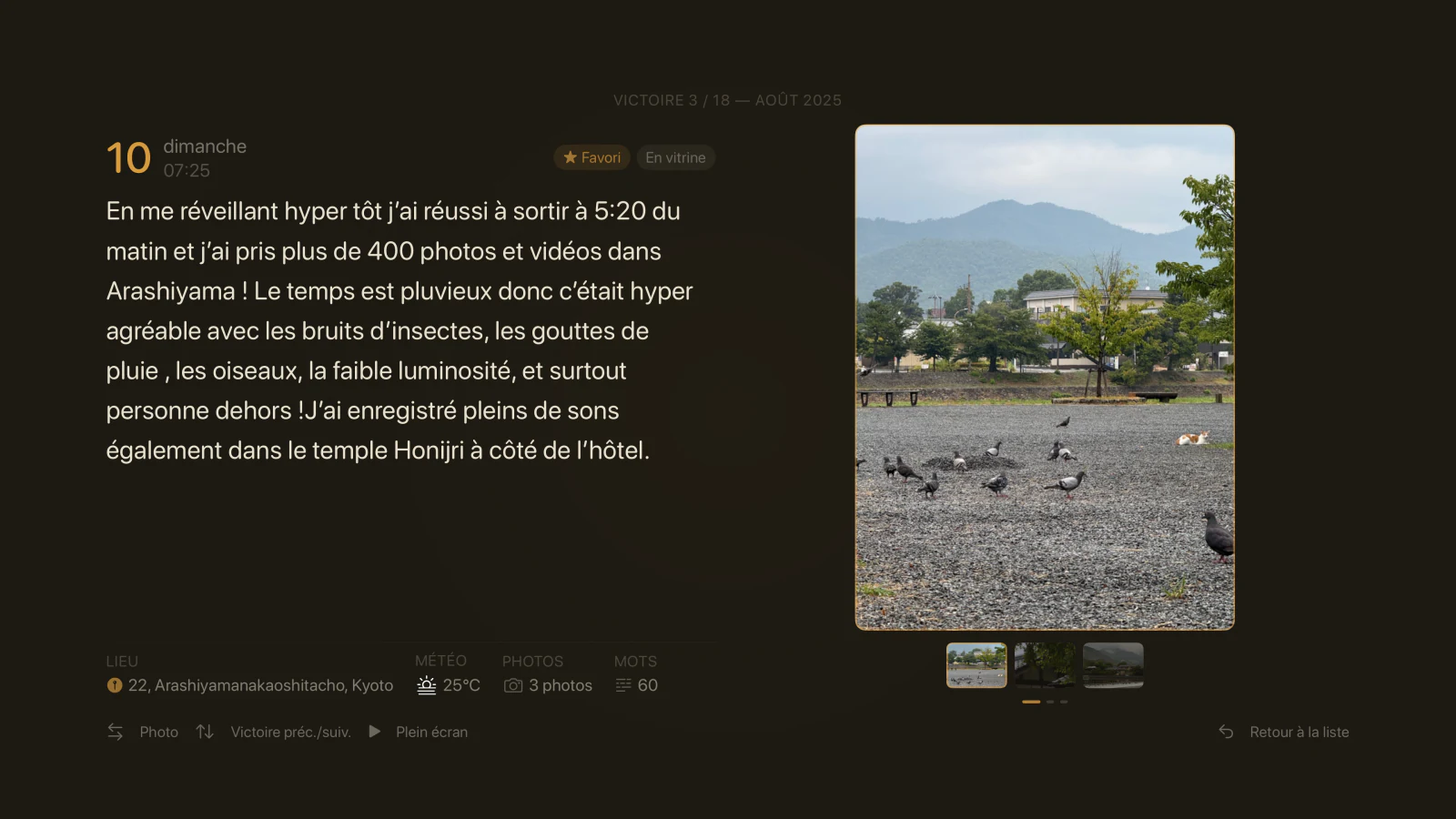
Because Potch has a strong Japanese aesthetic inspiration: the torii in the garden, the environments, the ambient sounds I recorded in Japan. Kyoto was the obvious choice since I stayed there for a while. And more specifically, it’s a neighborhood of Kyoto I’m particularly fond of: Arashiyama.
The weather data consists of real averages from that location: temperatures, precipitation, seasonal probabilities. The engine uses them to generate a coherent cycle. There are three time slots per day — morning, afternoon, evening — and the weather can change between each slot. You might get rain in the morning, sunshine in the afternoon, and clouds in the evening, for example.
Are the moon phases real?
Yes. The moon in the garden follows the actual lunar cycle. If it’s a full moon outside, it’s a full moon in your garden. It’s a tiny detail, but I find it creates a subtle connection between the real world and the world of Potch.
Does the weather affect gameplay?
Yes, a little. When there’s precipitation (light rain or during a storm), plants grow a bit faster. It’s a small bonus, not something decisive. The idea is that weather is part of the atmosphere, not a frustration mechanic.
There’s also a “Potch TV” object in the garden: a little retro TV that displays the weather forecast for the upcoming garden time slots.
🖌️ The interface
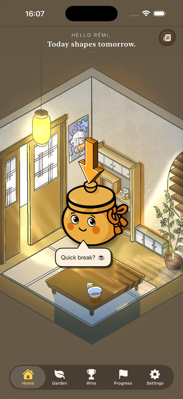
What does the interface modernization actually mean?
It all started with iOS 26 and the arrival of Liquid Glass (a new visual language introduced by Apple that gives a translucent, more lively look to certain interface elements). I had started integrating it on a few buttons and sheets (those panels that slide up from the bottom of the screen), and then…
While reworking the app every day, I realized the interface as a whole needed a proper modernization. Not just a fresh coat of paint, but a coherent redesign.
Subtle interface sounds (on top of the ambient sounds) are also present now. They can of course be disabled in Potch’s settings.
Weren’t you afraid of losing the app’s identity?
That was exactly my fear. When I launched Potch, I deliberately wanted to avoid the “like everyone else” or overly cold interface. There are visual conventions everywhere in the App Store, and Potch has always had its own personality.
Modernizing without homogenizing: that’s the challenge. I think I’ve found the right balance, but I’m not fooling myself: there will be adjustments in the coming weeks and months, based on feedback and how it integrates into daily use. It’s an iterative process.
I also added automatic dark mode (based on the user’s device preferences), especially for reading areas. It’s a comfort detail that truly changes the experience in the evening or in dark environments.
✨ Animations
Why so many animations in this version?
Because the previous interface was too static. You’d open the app, see a fixed background, tap some buttons — it lacked life.
Another notable point: the Potch mascot used to be static. Apart from an animation after adding a win, it didn’t move. Now, it’s much more alive.
So I worked on multiple layers of animation: particle and light effects for the environments (without weighing down devices — and that’s a delicate balance to find), and micro-animations within the interface itself. When something happens in the app, you can see it now. More will be added later.
It’s not just animation for the sake of looking pretty: it’s animation to give meaning to interactions.
⌚ Apple Watch, Apple TV, iPad
Why wait until 2.0 for these platforms?
Because 1.0 was already a lot of work for one person! And it’s not even my main source of income. You have to know how to prioritize. The iPhone version needed to be solid and well thought-out first.
That said, Apple Watch had been on my mind for a long time — I had even started developing it in parallel but without having the time to finalize it. The idea is simple: if you don’t have your phone handy, you can still quickly log a win from your wrist, by typing or even by voice, since Apple Watch supports that. It syncs automatically to the iPhone so you can complete it later if needed (add photos, edit the text…). I also added complications for watch faces, to keep Potch visible at a glance.
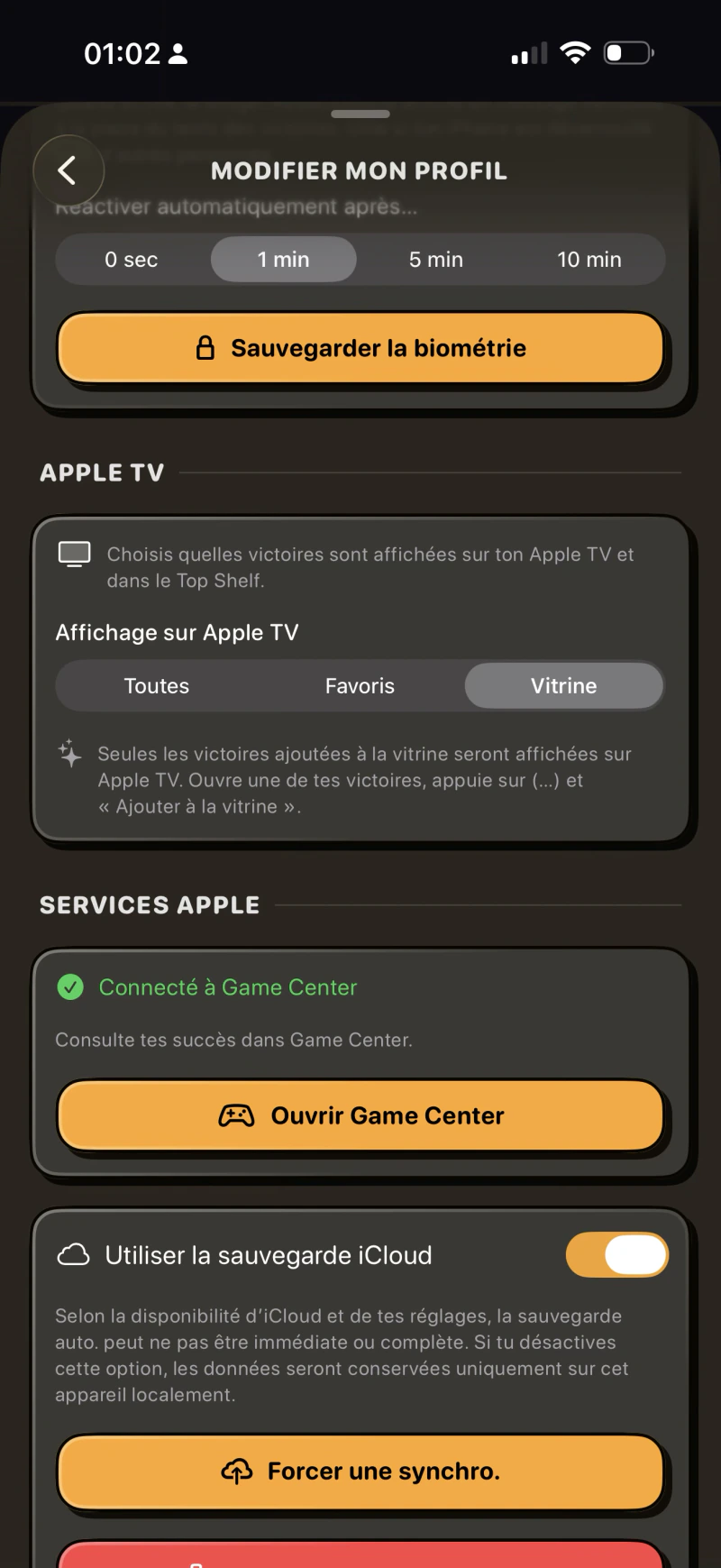
Apple TV is an idea I really like but that’s harder to explain: the concept is to display your best wins on the living room screen. Not everything — you can choose: all wins, only favorites, or only those you’ve marked as “on display” in the app. It’s a way to turn a screen you look at often into a space for positive reminders.
iPad: is it a truly dedicated layout? Was that complicated?
More than I expected. The classic mistake when porting an iPhone app to iPad is just wanting to stretch the interface. But that gives an ugly result that can be unreadable or even unusable. I didn’t want that.
I took the iOS base and reworked the layouts to take advantage of the larger screen and follow Apple’s guidelines as much as possible. Lists are more spacious, environments display better, views like the journey or stats use space more intelligently.
Is it perfect? Not entirely. There will definitely be adjustments in future versions. But it’s a real iPad app, not a stretched iPhone app.
Apple TV: who is it for?
For those who want to see their wins on the big screen. The idea came to me while looking at my own living room screen: it’s a space you look at often, sometimes absent-mindedly. Why not make it a space for positive reminders?
On Apple TV, Potch displays your wins one after another, like a slideshow. It’s simple, readable, and designed to be read from a distance.
What about showing personal wins on a shared TV screen?
That’s something I thought about a lot. Not everyone wants their wins displayed on the living room screen, especially if other people live in the household!
The solution: in Potch’s settings on iPhone, you choose what shows up on Apple TV. Three options: all wins, only favorites, or only those you’ve marked “on display.” That way, you stay in full control. Sync happens via CloudKit — there’s nothing to configure manually.
🔍 Search and retrospective
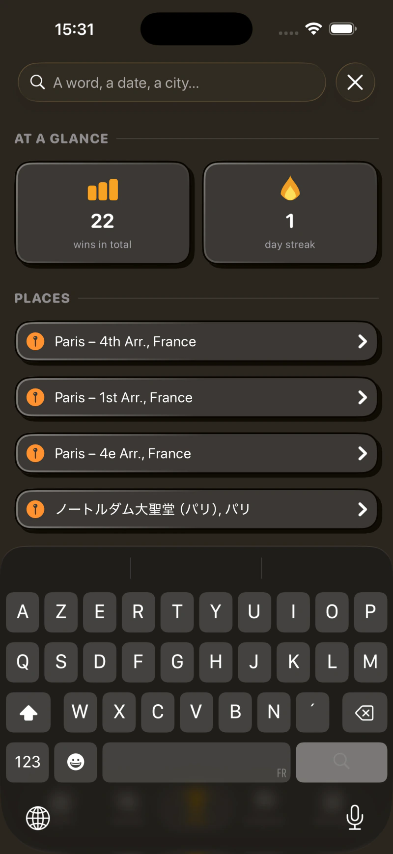
Has search evolved in V2.0?
Yes. At the start of the 2.0 work, I had tried making search always visible in the navigation bar, accessible from anywhere in the app. In practice, it didn’t really fit: settings had more reason to live in that bar than search did, and on top of that the “My Wins” view is already a hub that gathers all categories together. That’s where search belongs.
So I went back to a dedicated view like before, accessible via the magnifier in the top-right corner of the main screen. What really changes is what’s inside: suggestions appear as soon as you open it. A quick glance at your stats (total wins, day streak), your recent places… It’s designed so you can find what you’re looking for without even typing, in most cases.
And of course you can still search by word, by date, by city when you have a specific query in mind.
And the monthly retrospective?
It’s a feature I love. At the end of each month, Potch automatically generates a visual summary of all your wins. It’s a bit like what the Apple Photos app does with memories.
If you’ve written a majority of wins in a specific place, the retrospective adapts. For example: “March in Paris, France.” If it’s spread out, it’s more generic. The idea is that you can look back and think “wow, I did all that this month.”
And you can export it. Share your retrospective on social media or save it. It’s a format designed to be shared, with a polished design.
Is it actually good for your psychology to reread your wins?
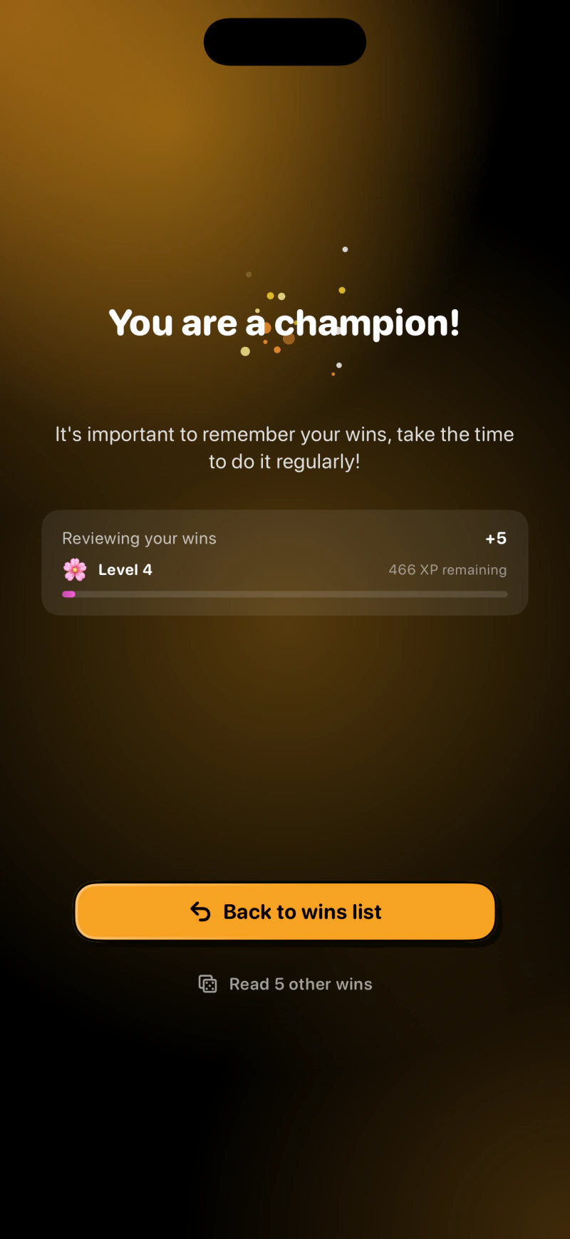
It’s even proven. Positive psychology shows that rereading positive experiences strengthens the sense of competence and self-confidence. It’s actually the same logic behind the “win reminder” notifications I added: at a frequency you choose, Potch can send you a random win from your past. It’s a small unexpected moment of pride in your day.
What if I want to read wins randomly?
You can, through the matching widget that displays a random win at a configurable frequency, or through a new reading button in the all-wins section that pulls 5 of your wins at random. You can then scroll through them like on social media — but here in Potch, it’s a non-infinite and actually useful scroll!
♿ Accessibility
That’s a feature people often forget to mention…
And that’s exactly why I’m bringing it up. Potch wasn’t accessible: VoiceOver didn’t work properly, and several other iOS accessibility features were poorly supported.
The reason is simple: when I started developing Potch, I was learning Swift (the programming language) and iOS development at the same time. It was my first mobile project back then. Accessibility is something you learn to do well with experience and project maturity. It’s not an excuse, it’s a reality, and it’s now fixed.
Every app deserves to be accessible. I’m glad I took the time to do it properly in this version.
🔔 Notifications
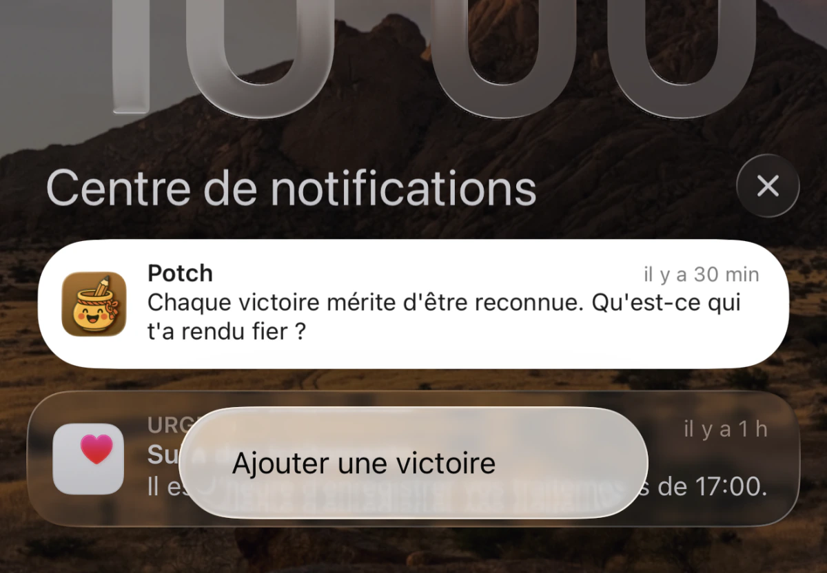
Notifications have changed: why?
Two reasons. The first is a bug from the old version: notifications weren’t always sent. That’s not acceptable for an app that’s supposed to support you every day.
The second is a matter of tone. I didn’t want notifications that feel like task reminders, for example: “You haven’t logged your win today!” That’s cold, almost guilt-inducing too.
I wanted it to feel like a friend checking in on you. Something warm, that makes you want to open the app rather than avoid it. There are now several message variations, and the distribution throughout the day and week has been reworked to feel more natural.
There will probably be adjustments on this, based on feedback and daily usage, but this is my vision for it.
☁️ iCloud sync
Is this a sensitive topic?
Yes, honestly. iCloud sync is something that stresses me because I can’t control everything: Apple manages the infrastructure, I manage how the app interfaces with it. But that’s precisely why the code on my end needs to be flawless: you have to think of every possible scenario.
The old implementation had gaps. I rewrote everything. It’s more robust, more predictable, better handled in case of conflicts. Is it perfect? I’m still testing. But it’s a significantly more solid version.
Your data, your wins — that’s precious. I take it very seriously.
Why use iCloud?
For the privacy and security of the infrastructure. If I had to build my own sync system, it would be way too heavy to maintain long-term — I’d need to handle security, maintenance, privacy… which would represent a massive daily workload, incompatible with my schedule.
Beyond that, iCloud is a native solution across all Apple platforms, meaning there’s no additional installation or sign-up needed with a third-party service.
🧩 Widgets
The new widgets took a while to arrive…
Since Potch launched, the widgets never satisfied me visually. I knew they needed to be redone, but there was always something more urgent.
Now it’s done: they’re modernized, and there are new ones. But new things are coming. The next step will be integrating new illustrations for the widgets — for example, the Potch mascot appearing differently depending on the day or time, randomly. It’s planned, it’s in progress — the code is ready for it, and I need to discuss my ideas and what I want to show with the illustrators, and when I have the funds to do so.
⭐ Potch+
The premium offering has evolved, including differences with the free version. For example, some widgets have moved behind the subscription: why this change?
It’s a difficult decision, and not one I take lightly.
Before, the few available widgets were free. But I realized that almost nobody was making donations to support development. And without funding, it’s simply impossible to seriously maintain an app long-term, let alone pay freelance illustrators — which is now a reality of the project.
Hiring an artist for assets like the environments or objects is a real cost. And there will be more illustrations, more assets, more visual evolutions to come. All of that has a price that amounts to thousands of euros.
So yes, some widgets are now reserved for Potch+ subscribers. Two widgets remain free. It’s a balance I hope is fair, and if you love the app and want to see the project keep growing, it’s the best way to support it concretely.
🌍 8 languages
Potch now speaks German, Japanese, Spanish, Italian, Portuguese, and Indonesian. How does localization work?
It’s deep work. It’s not just about running texts through an automatic translator: you need to make sure every sentence feels natural in the target language, that the tone is consistent, and that certain concepts (like “writing down your wins”) translate well culturally.
It’s collaborative work here — if there are translation errors, you’re absolutely welcome to send me feedback here.
🔭 What’s next?
What can we expect after 2.0?
Version 2.0 is a new foundation: a more solid architecture, a more modern interface, a garden that gives you a reason to come back every day. It’s not an ending, it’s a beginning.
There’s still so much I want to improve, refine, and add. Illustrations in widgets — the Potch mascot appearing differently depending on the day or time. Seasonal environments: a winter scene in January, cherry blossoms in spring. New plants, new event packs for the garden. New features for Potch+. Interface adjustments based on your feedback.
The garden in particular is a space (no pun intended) where I want to keep building. New buildings, new decorative elements, new animations. It’s one of the hearts of the app now, and it will keep evolving!
If you have ideas or feedback, you’re welcome on Discord: it’s the most interactive place where I share updates. You can also reach me through social media or send me an email via the website’s contact page.
See you soon for what comes next 😊